
CrowdSent Blog Team · Published 6 October 2026 · Research skills
Historical sentiment becomes useful when you can explain what changed, over which period, and in which set of observations. Start with those details before interpreting the shape of a line.
In this guide, we walk through five checks you can use with historical sentiment data. They help you turn a market sentiment chart into a clear research note, including the questions the chart cannot answer on its own.
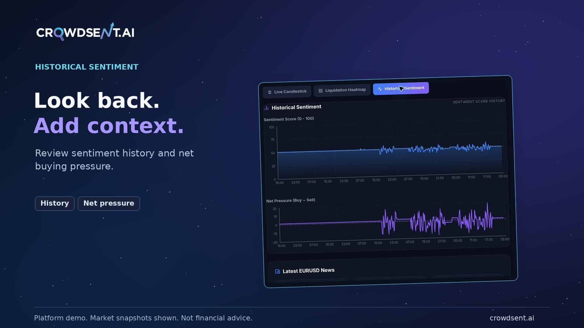
1. Define your historical sentiment measure
Before reading the line, find the definition of the number. Does it describe positive or negative language, a positioning ratio, or confidence in a classification? Each measure answers a different question.
Record the selected asset or pair, the score range and what its endpoints mean. If the source or scoring method is not documented, write “method not available” in your notes. Two tools can display similar numbers while measuring different things.
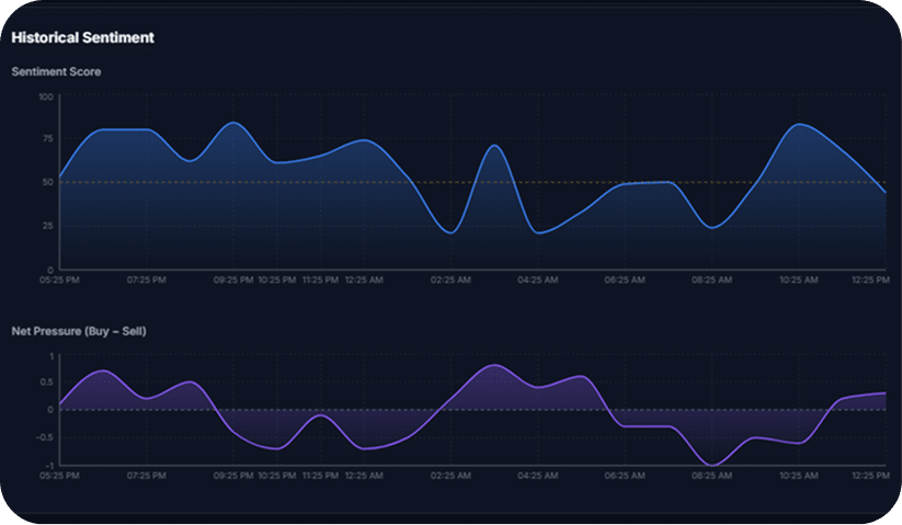
For a closer explanation of polarity and classification confidence, see our guide to what a sentiment score means. The important habit is to read the definition before applying a familiar interpretation.
2. Match the timeframes on your market sentiment chart
The visible window and the observation interval are separate details. A chart may cover a day while showing hourly summaries. Another may cover the same day with irregular observations. A label such as “1H” needs context: check whether it describes the window, the grouping interval or another setting.
When you compare historical sentiment data, use the same market, duration, time zone and scale. Also check whether the latest period is complete. Comparing a finished day with a day that is still unfolding can produce a misleading visual contrast.
Aggregation matters. An average describes the values across a period; an end-of-period observation describes its closing point. The Federal Reserve Bank of St. Louis illustrates this distinction in its time-aggregation explainer. This is a general data-reading principle, not a statement about CrowdSent’s calculation method.
Worked example: comparing historical sentiment summaries
The following numbers are entirely fictional. They illustrate a general measurement problem, not a CrowdSent formula, a real market reading or an investment outcome.
Imagine that a research tool records four equally spaced polarity observations during a completed hour: 0.10, 0.20, 0.40 and 0.70. Its documentation defines polarity on a scale from −1 to +1. The simple average of those four observations is 0.35. The final observation is 0.70.
Two displays could therefore show 0.35 and 0.70 for the same hour without either copying the wrong underlying number. One summarises the observed hour; the other shows its last recorded point. If the labels are missing, choosing the larger value as the “true” historical sentiment reading would be unjustified.
Now imagine the following hour contains only its first observation, 0.50. Comparing that incomplete hour with the previous hour’s final value could suggest a decline. Comparing it with the previous hour’s average could suggest an increase. The disagreement comes from the comparison you selected. It does not establish two opposing facts about the wider market.
We would record the comparison this way:
- Measure: Text polarity on a documented −1-to-+1 scale.
- First window: Four equally spaced observations in a completed hour; mean 0.35 and final observation 0.70.
- Second window: One observation, 0.50, in an incomplete hour.
- Conclusion: The displayed summaries differ; a like-for-like hourly comparison is not yet available.
- Next check: Wait for the defined window to complete, then use the same summary method and inspect its coverage.
Equal spacing and equal weighting are explicit assumptions in this example. If observations arrive irregularly or represent different amounts of material, a simple average may answer a different question from a time-weighted or sample-weighted result. Use the documented method rather than improvising a replacement. This is why a market sentiment chart needs labels as well as a line.
The same discipline applies when changing zoom levels. Preserve the initial view, note the new window, and explain which question the second view addresses. Do not keep changing the range until the picture supports the explanation you already prefer.
Check how boundary observations are assigned. If one window ends at 10:00 and the next starts at 10:00, an observation at exactly that time needs a consistent rule. Otherwise, a hand-made comparison could count the same point twice or omit it. Follow the source’s documented interval boundaries. If that rule is unknown, record the uncertainty instead of silently choosing whichever assignment produces the preferred result.
3. Inspect gaps in historical sentiment data
A smooth line does not tell you how complete the underlying observations are. Look for update times, sample counts, source coverage and gaps. A chart may connect two recorded points across a period with no observation.
Use this short coverage check:
- Freshness: When was the most recent observation recorded?
- Completeness: Are any periods absent or still being collected?
- Consistency: Did the source set or method change between the windows?
- Independence: Could repeated copies of one story account for much of the material?
If those details are unavailable, keep the conclusion narrow. “The displayed value rose, but the source coverage was not shown” is a useful observation. Treating an unknown period as neutral sentiment would add a claim the data has not established.
Check the historical sentiment sample
A historical sentiment comparison can change because the material being measured changed. Before describing a shift in the wider discussion, inspect which sources and observations are represented in each window. A consistent scale is necessary, but it does not make two different samples equivalent. Record any language or venue filters, because they also define the sample.
Entirely fictional example: An earlier window contains 20 comments, of which a hypothetical classifier labels eight positive. A later window contains five comments, of which it labels four positive. The positive share is 40% in the earlier sample and 80% in the later sample.
Those percentages answer a narrow question about the comments collected. The later window contains fewer positive comments in absolute terms, despite having a larger positive share. Neither fact, by itself, establishes how the wider market feels. The example describes classification counts, not a CrowdSent score or a probability of a price movement.
The next question is how the comments entered the sample. Suppose the earlier material came from several conversations, while the later material came from one thread. A difference in the selected conversation could contribute to the change. You would need more evidence before interpreting the two percentages as a broad shift.
When checking historical sentiment data, keep the numerator and denominator together whenever the source provides them. A share without its sample size hides part of the measurement. If the interface supplies only a combined score, do not reverse-engineer an imaginary number of comments or contributors from that score.
Separate repeated information from independent observations
Counting posts and counting independent evidence are different tasks. Several contributors might share the same headline while expressing different opinions about it. That can provide multiple examples of reactions, but it remains one underlying announcement. Decide which question your sentiment analysis is trying to answer before choosing what to count.
Use a small source audit to make that distinction visible:
- Origin: Identify the original document or event behind repeated claims.
- Contribution: Note which items add a new observation, interpretation or source.
- Selection: Record whether you inspected a complete available set or selected examples.
- Limit: State what the visible sample cannot establish about people or sources outside it.
Do not automatically discard repeated references: repetition may itself be part of the discussion you want to study. Equally, do not present repeated copies as independent confirmation of the underlying fact. Keep the source question and the reaction question separate in the note.
On a market sentiment chart, the line alone may not expose these distinctions. Treat the chart as the start of the investigation. If source-level detail is unavailable, the useful conclusion is that the displayed measure changed while its composition could not be checked. That preserves a clear observation without making an unsupported claim about the entire crowd.
4. Test the explanation behind a sentiment change
In historical sentiment analysis, describing a change and explaining its cause are different steps. First write what the chart shows. Then propose an explanation and list what would help you check it.
Hypothetical example: A researcher sees a higher sentiment value in a later window and notices an announcement published nearby in time. The chart supports an observation about the displayed value. It does not yet establish that the announcement caused the change.
The next checks are practical: verify the original announcement time, read the source material, check for repeated coverage and consider another plausible explanation. Our market-news verification guide shows how to follow a headline back to its evidence.
Historical sentiment can help organise this investigation. A visual pattern alone cannot establish how reliably it predicts a future outcome. That separate claim needs a defined outcome, a time horizon and appropriate testing.
Align historical sentiment with price timestamps
If your research question compares sentiment and price, set up the comparison before interpreting whether one appears to lead the other. A price observation and a sentiment observation can have different collection, aggregation and publication times.
Keep four labels separate: the time an underlying event occurred, the period a measure covers, the time the source published it, and the time you accessed it. Those timestamps may be close together, but they are not interchangeable. Use a consistent time zone and retain the original zone in your note if a conversion was needed.
Fictional timing example: A sentiment summary covers 09:00–10:00 UTC and becomes available at 10:05. A price chart shows a change at 09:45. Placing the completed sentiment summary at 09:00 because its window started then would make information from later in the hour appear available earlier. It would create a misleading visual lead.
The defensible historical sentiment comparison is narrower: the summary covers an hour that includes the price observation, and it was published afterwards. That does not tell you which individual comments existed at 09:45 or whether they were already reflected in an accessible measure. Answering those questions would require appropriately timestamped underlying information.
Also compare equivalent instruments. A label referring to one exchange, contract or quote currency may not describe the same series as another chart. Record the exact pair and source rather than assuming two similarly named markets are interchangeable. If you cannot establish comparability, describe the views separately.
A research note can still be useful when the answer is “not enough information.” Save the event window, the available timestamps and the mismatch. You have identified what additional evidence is needed instead of turning a plotting choice into a predictive claim.
Avoid hindsight when reading historical sentiment
A historical observation date does not necessarily identify the version of the information that was available then. Sources can revise data, correct errors or add material later. Reopening a page today may therefore show a different record from the one a researcher could have read at the earlier moment.
The St. Louis Fed’s ALFRED explanation of vintage data describes how earlier versions of economic data can be preserved as sources revise them. It is a useful illustration of the distinction between an observation period and the information available on a particular date. It does not establish how any CrowdSent dataset is stored.
When reviewing historical sentiment data, ask whether your evidence is an archived snapshot, the latest reconstructed view or a source whose revision history is unknown. Keep those categories visible. If the earlier version cannot be recovered, avoid claiming that today’s display reproduces exactly what users saw then.
Choose a clear information cutoff for an event study. Material published after that cutoff belongs in the later review, even if it describes something that happened earlier. This helps prevent a completed announcement, later correction or retrospective explanation from being inserted into an earlier research note.
There is a second hindsight problem: selecting the example only after seeing an outcome. One attractive historical pattern cannot establish how often the same interpretation would have been useful across other periods. Keep a record of why the window was chosen, including whether the selection was made before or after you saw the result. Do not turn a teaching example into a claim of tested performance.
In a dated review, distinguish a reasoning error from new information. “I compared an hourly average with a final observation” describes a process error you can correct. “The source later revised its figures” describes a change in evidence. Recording the difference makes the review more informative than simply labeling the original note right or wrong.
5. Record historical sentiment so you can revisit it
A good note preserves the settings and the gaps as carefully as the conclusion. Copy these fields when reviewing a market sentiment chart:
- Question: What specific change am I investigating?
- View: Exact asset or pair, window, interval and score definition.
- Time: Capture date and time zone, plus the data update time when shown.
- Observation: What visibly changed, without adding a forecast.
- Explanation to check: A possible cause and an alternative.
- Limits: Missing observations, uncertain sources or an undocumented method.
- Next check: The original document or additional evidence needed.
Save a dated screenshot when reuse is permitted and it helps preserve context. Keep the selected market and timeframe visible. A screenshot records an interface at one moment; it should not later be presented as live market data.
Bring the checks into your CrowdSent research
CrowdSent includes a historical sentiment view for the market you are researching. Keep the selected market and timeframe in sight, then use these five checks to organise what you observe and what still needs investigation.
Frequently asked questions about historical sentiment
What can historical sentiment tell me about an earlier period?
It can show how a defined measure changed across the observations available for that period. Check what the measure describes and which sources it covers. The resulting pattern does not automatically represent everyone’s views or explain what caused the change.
What is the difference between a chart window and its interval?
The window is the full span you are viewing; the interval describes how observations are spaced or grouped within it. A one-day window might contain hourly summaries. Read the labels carefully, because a short label alone may not identify which setting it describes.
Why might an average and a closing value disagree?
An average combines observations across a period, while a closing value uses its final observation. They answer different questions, even when the period is identical. The St. Louis Fed’s aggregation guide illustrates this distinction. Check the documented summary method before comparing displays.
Can I compare historical sentiment across different tools?
First compare their definitions, scales, source selections, time zones and summary methods. Similar-looking values may describe different quantities. If an important detail is undocumented, describe the two readings separately and explain why a direct numerical comparison is not yet justified.
Does a gap in the chart mean sentiment was neutral?
No. A missing observation provides no measurement for that period. A line drawn between available points may conceal the gap. Record when observations are absent and whether the chart interpolates or carries values forward, if its documentation explains that behavior.
Why should I record the sample size beside a percentage?
A percentage describes a share of a particular collection. Four positive comments out of five and forty out of fifty both equal 80%, but their collection sizes differ. Retain the counts and selection method rather than assuming matching percentages describe equivalent samples.
How do I know whether the latest period is complete?
Compare the period’s end time with the source’s latest update and collection rules. A current interval may still be accumulating observations. If completion or update timing is unclear, label the period as uncertain and avoid comparing it as though it were finished.
How should I align a news event with the chart?
Keep the event time, publication time and measurement window separate. Establish when the information became available before describing which came first. A summary published after an event may include later material, even when its chart label marks the start of an earlier window.
Can today’s display differ from what was available at the time?
Yes, if the source revises or reconstructs its history. ALFRED’s vintage-data explanation shows why earlier and later versions can differ. For your own source, check whether an archived version exists. Do not assume a current view recreates an earlier screen or dataset.
What if the chart leaves a question unanswered?
Record the visible finding, name the missing information and specify what would resolve it. For example, you may observe a higher displayed value while the source coverage remains unknown. Keeping that limit explicit makes the note useful without extending it beyond the evidence.
Sources checked: Federal Reserve Bank of St. Louis, including its ALFRED documentation, 6 October 2026. The checklist and hypothetical example are educational guidance from the CrowdSent Blog Team, not a trading recommendation.